
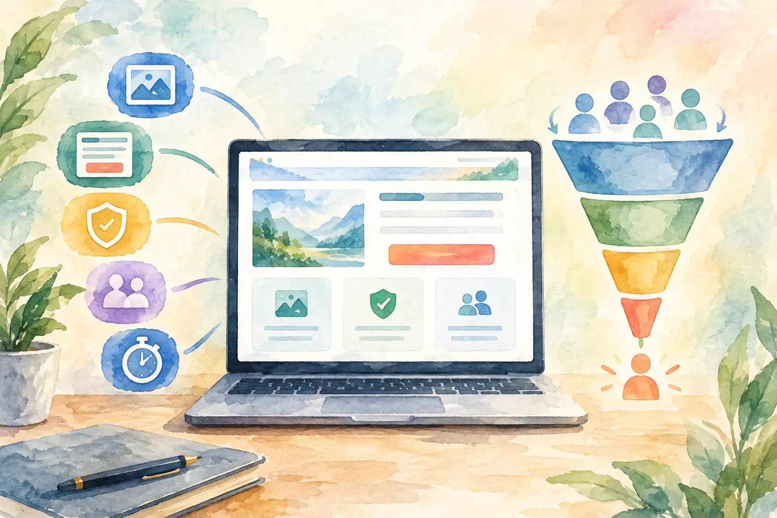
A landing page can have polished branding, strong traffic, and a sizable ad budget, then still fail for one ordinary reason: the visitor cannot quickly tell what to do next. The best conversion landing elements remove that hesitation. They give a qualified prospect the information, confidence, and path to act without asking them to hunt through a full website.
For a Southwest Florida service business, that action might be requesting an estimate, booking a consultation, calling the office, or asking for a product recommendation. The page does not need to impress everyone. It needs to help the right person take the next reasonable step.
What a conversion landing page is supposed to do
A landing page is not simply a shorter homepage. A homepage serves several audiences at once: current customers, job candidates, referral partners, and people still learning what the company does. A landing page should focus on one offer, one audience, and one primary action.
That focus matters because paid clicks, local search visitors, and email recipients arrive with different levels of intent. Someone searching for an emergency repair needs an obvious phone number and proof that a real person can respond. Someone considering a larger project may need examples, a process, and a low-pressure consultation form. The best page for each situation depends on the decision being made.
Conversion rate is useful, but it is not the only measurement. A page that produces many low-quality form submissions can create more administrative work without adding revenue. Look at lead quality, booked appointments, answered calls, follow-up speed, and closed business alongside the number of conversions.
Best conversion landing elements start above the fold
The top of the page must answer three questions in a few seconds: What do you offer? Who is it for? What should I do now? Everything else supports those answers.
A headline with a specific business outcome
A vague headline such as “Quality Service You Can Trust” does not give a visitor enough to work with. It could describe nearly any business. A better headline names the service and the practical result: “Custom Websites Built to Generate and Route More Leads” or “Schedule Reliable Commercial Service for Your Fort Myers Property.”
Specificity does not mean stuffing every detail into one line. Keep the headline clear. Use the supporting copy beneath it to explain the service area, the type of customer, timing, or a meaningful differentiator. If your business serves both residential and commercial clients, separate the campaigns and landing pages when their needs differ. Trying to speak to both at once often weakens the message for each.
One primary call to action
A page can offer a phone number, form, chat option, and calendar, but it should still have one primary action. If the goal is booked consultations, make “Schedule a Consultation” the dominant button. If fast phone response is the advantage, make calling the primary action and position the number clearly on mobile.
Button language should describe the next step rather than rely on generic words like “Submit.” “Request Your Estimate,” “Check Appointment Availability,” and “Talk With a Project Specialist” are clearer because they set expectations.
Avoid asking for a commitment that is too large too early. A visitor who has just learned about your company may be willing to request information, but not ready to “Start Your Project.” Match the call to action to their stage of consideration.
A visual that confirms the offer
Images, short video, screenshots, and diagrams can do real work when they show the customer what they are getting. A contractor may show completed work. A professional practice may show a welcoming office and staff. A software-enabled service may show the workflow or customer portal.
Generic stock images are not automatically harmful, but they rarely build confidence on their own. Use real visuals where possible, especially when local customers are evaluating whether your team, location, or work looks credible. Keep file sizes controlled. A large image that delays the page on a phone can cost more conversions than it adds.
Build confidence before asking for details
Most prospects do not object to filling out a form because typing is difficult. They hesitate because they are unsure what will happen next. Good landing pages answer that concern before it becomes a reason to leave.
Proof that is relevant to the decision
Testimonials, reviews, certifications, years in business, project examples, and service-area details can all help. The key is relevance. A visitor considering website management wants evidence of dependable support and clear accountability. A visitor calling for urgent service wants reassurance about response, availability, and process.
Use proof close to the claim it supports. If you say your team handles implementation and ongoing support, place a concise customer quote or explanation near that statement. A wall of logos or an isolated testimonial carousel may look busy without resolving a real question.
Thirty years of experience can be meaningful when it explains why your process is reliable and practical. It is less useful as a standalone boast. Connect experience to the customer outcome: fewer handoffs, better planning, clearer support, or systems that continue working after launch.
Plain-language process details
People convert more readily when they know what follows the click. A short section can explain that a team member reviews the request, contacts the prospect, confirms needs, and recommends the appropriate next step. This is especially useful for services that involve a custom scope rather than a fixed product.
Do not hide behind phrases such as “tailored solutions” without explaining what is tailored. State what information you need, who will respond, and whether the first conversation is a consultation, assessment, or estimate. Clear process language qualifies leads as well as reassuring them.
A form that respects the visitor’s time
Every form field creates friction. Ask only for information your team will use in the first follow-up. For many businesses, name, phone, email, and a short description of the need are enough. If location, service type, or budget range materially changes how you respond, those fields may be worth adding.
There is a trade-off. Short forms usually produce more inquiries, while longer forms can produce better-qualified ones. Test based on your sales process, not a universal rule. If your team can qualify quickly by phone, a shorter form often makes sense. If every inquiry requires substantial preparation, a few targeted questions may save time.
Make the form easy to use on a phone. Labels should remain visible, error messages should be clear, and the submission button should not disappear beneath unnecessary fields. Add a brief privacy reassurance when appropriate, but do not surround the form with distracting fine print.
The follow-up system is a conversion element too
A form submission is not a finished conversion if the request sits in an inbox until the next day. Many small businesses spend time improving page copy while leads are still getting lost between a website, a phone system, and a staff member’s task list.
The best conversion landing elements extend beyond the page. Calls should be routed to the right person or handled with an after-hours option. Form submissions should enter a shared system, trigger an appropriate acknowledgment, and create a clear follow-up responsibility. A prospect should not have to repeat their information when they call after completing a form.
This is where integration changes the practical result. When the website, phone line, and Client Connect Suite work together, staff can see the source of a lead, respond consistently, and track whether an inquiry became an appointment or customer. Automation can acknowledge a request and route it quickly. People should still handle nuanced conversations, pricing decisions, and judgment calls.
Speed matters, but a rushed, generic reply can damage trust. A useful first response confirms the requested service, gives a realistic expectation for the next contact, and makes it easy to call if the need is urgent.
Test the page without creating busywork
Landing page improvements should be based on evidence, not a weekly redesign. Start by checking where visitors leave, which devices they use, whether calls increase, and whether form leads become real opportunities. If mobile visitors abandon at a much higher rate, review page speed, form length, button placement, and click-to-call behavior before rewriting everything.
Change one meaningful variable at a time when possible. Test a clearer headline, a different primary call to action, fewer fields, or stronger proof near the form. Give the change enough traffic and time to produce useful information. Small businesses often do not have the volume for elaborate testing programs, so prioritize obvious friction first.
Also review the traffic source. A strong landing page cannot fully compensate for an ad or search listing that promises something different. The wording in the ad, the page headline, and the offer should align. If a visitor clicks for a specific service and lands on a general company page, the disconnect creates doubt immediately.
Make the next step easy to trust
A high-converting landing page is not built from tricks. It is built from clear promises, credible proof, low-friction action, and reliable follow-up. The right elements depend on your service, sales cycle, and customer urgency, but the standard stays the same: a qualified prospect should know exactly why they should contact you and what will happen when they do.
Before sending more traffic to any page, try completing the process yourself on a phone. Call the number, submit the form, and see how long it takes to receive a useful response. That simple exercise often shows the next improvement more clearly than another round of design opinions.